You should see a screen like—
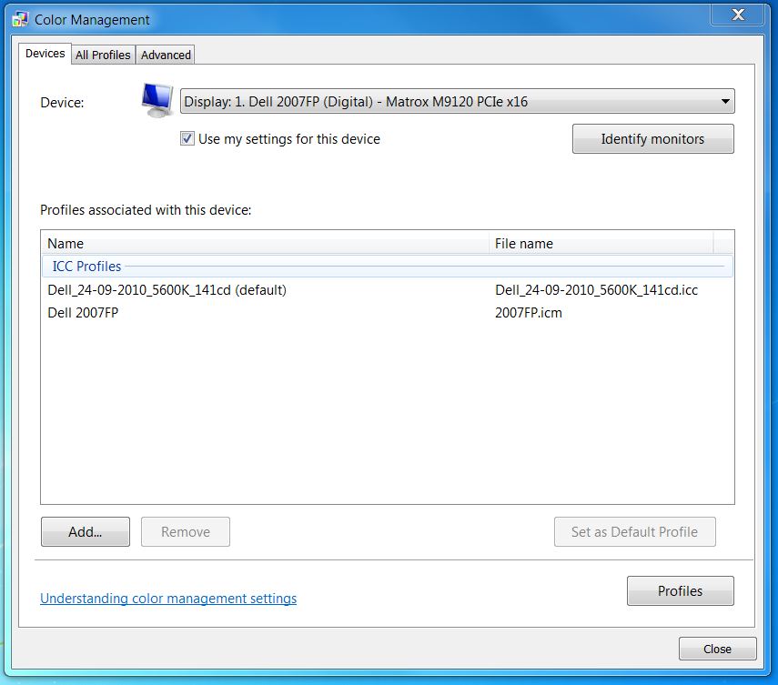
When trying to debug your colour management workflow, one of the problems you may face is to discover whether or not your software is actually using the display profile that you have carefully made and then associated with your monitor screen. There are three aspects to this problem—
This page gives you the tools to answer questions 2 and 3.
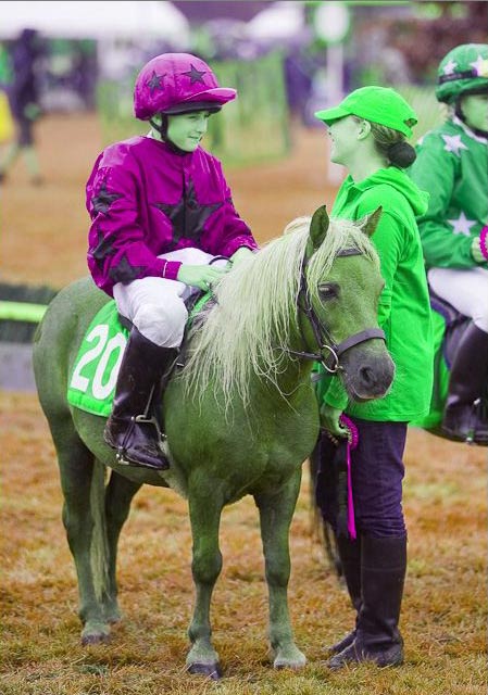
The changes made by a display profile are often quite small, so it's hard to tell if it is in effect. To make it easy to tell, we need a display profile that really makes a big difference to the image. So I created a profile called pvf_display_weird1.icc that does make a big difference.
This profile has standard gamma 2.2 tone response curves, so it is no use for tackling question 1 above. But it has a very non-standard XYZ-to-RGB conversion matrix: this matrix swops the red and green colourants. Using this profile basically makes red things in your photos look green, and vice versa. But it does so if and only if the application you are using to display the photo is using the profile to convert from the colour space of the photo (perhaps sRGB or AdobeRGB) into the color space of the display profile.
Just install the profile in the normal way. These instructions are for Windows 7; you'll have to adapt them if you have some other version of Windows.
You should see a screen like—
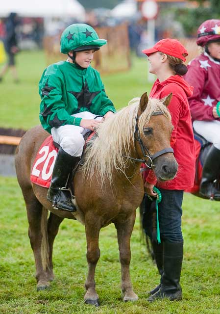
Find a photo that has some clean reds and greens in it, and make sure that it has a profile embedded in the jpg file. If you haven't got one, download this one which has sRGB embedded.
Display this photo on your screen using whatever application you want to test. For example, you could open the photo in an image editor such as Photoshop, GIMP or IrfanView. Or you could open it in a web browser such as Internet Explorer, Chrome, Firefox or Safari.
If the application does not apply display profiles properly, the photo should look normal. If it does apply display profiles properly the photo should be displayed with reds and greens interchanged.
If you have a multi-monitor set up, you can try setting the weird profile on one particular monitor and then seeing if the application notices it. You should find that Photoshop and Lightroom notice the profile and change the appearance of the displayed photo as you move their windows onto or off the relevant monitor. At present, in 2011, you should find that Firefox and Safari only notice the profile if it is set for screen 1; if screen 1 has the weird profile, then these two browsers will show photos with reds and greens interchanged whatever monitor they are running on. Internet Explorer 8 won't notice the profile at all. Internet Explorer 9 should, but I don't know what it does in a multi-monitor set up.
I won't say “Have fun!” because colour management really isn't fun. It was not for nothing that Scott Kelby entitled his chapter on colour management Anger Management. But I hope that this technique may help to translate anger into progress.
Peter Facey, Winchester, England
20110224 originated