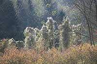
As discussed elsewhere on my site, this photo has dispersed highlights that are blown, although this is not apparent until one looks at the image in Photoshop.
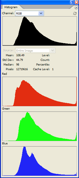
The histograms produced by Photoshop CS2 are shown below right. You can clearly see the thin vertical line at the right hand edge of each histogram, indicating a non-zero count at the maximum pixel value, corresponding to blown highlights.
Whilst looking at these histograms I got to thinking "I wonder what exactly Photoshop is showing me here". As I didn't find a very clear explanation in the help file or the various books about Photoshop, I did some experiments which I report here.
This article is not intended to explain how to interpret histograms when manipulating your images. If that's what you want I suggest you try, for example, Michael Reichmann , dpreview , videoproc or photoxels. I am merely concerned here to explain exactly what quantities Photoshop is plotting in its various different histograms.
All the graphs are similar in one respect: the horizontal (or X) axis runs from a minimum value at the left to a maximum value at the right, and represents the range of values that the quantity plotted could take on. Let us call the quantity plotted f, which is some function of the underlying pixel data. The vertical (or Y) axis ranges from 0 up to some undefined maximum, and represents a count of the number of pixels having particular values of f. Any point (X,Y) on the displayed curve indicates that there are Y pixels in the image for which f evaluates to X.
The red, green and blue graphs are pretty obvious: they show the count of the number of pixels whose red, green or blue channel has value X. Notice, however, that the three graphs are not drawn to the same vertical scale. It seems that Photoshop devotes the same vertical space to each graph, and adjusts the Y scale so that the curve just fits into this space (in this example the scale of the red graph is set by its right hand edge).
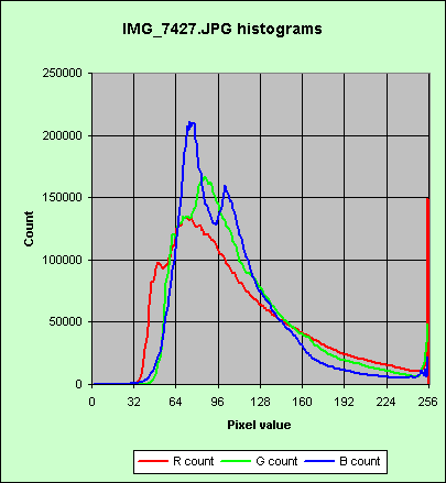
If we drew these three graphs to the same Y scale then it would look like this:-
Note also that, although you can run your cursor along the X axis of the red, green, or blue graphs, the figures displayed in response to that action immediately under the top graph relate solely to the top graph.
The "channel" drop down list at the top of Photoshop's histogram palette allows us to choose a variety of functions for the top graph. We could choose "colours", "luminance" or "RGB". What do they represent?
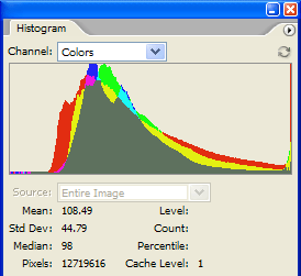
The "colours" option is the result of plotting the red, green and blue curves, to the same Y scale, on top of one another. Compare my graph above left with this "colours" display:-
Where red and green overlap, they make yellow, and so on. Note that the blue curve runs off the top of the Photoshop display.
If we choose "luminance" Photoshop plots the function f = 0.30*R + 0.59*G + 0.11*B which is the standard definition of the luminance of an RGB signal.
If we choose "RGB" we get a plot like that shown at right. What does that represent?
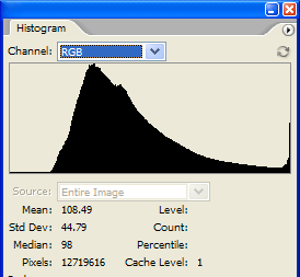
I couldn't find any definition of this, so I wrote the image out as a BMP file, and wrote a C program to calculate histograms from it. (I used a BMP file because its format is easy to decode.) It transpires that, in Photoshop's "RGB" histogram, the function plotted is the sum of the red, green and blue curves, plotted on an arbitrary Y scale. Strictly speaking, that is not a histogram, rather it is the sum of three histograms. More formally, if N(c,x) is the number of pixels whose c colour channel has value x, then what RGB plots is y = g(x) ≡ N(R,x) + N(G,x) + N(B,x).
Note that, with this definition, g(255) does not accurately reflect the number of blown pixels because, where a pixel has two channels blown it will be counted twice, and where it has three channels blown, it will be counted thrice.
In this example image, Photoshop shows g(255) to be 219,806. The number of pixels having at least one channel blown is, however, 174,319 but you couldn't learn this from Photoshop. To get that figure you have to evaluate f(x) = MAX(R, G, B), but Photoshop does not provide that function.
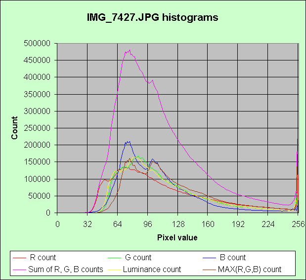
The figure below shows all these different functions plotted to the same scale:-
I should add that the above description is based on Photoshop set in RGB working space, and viewing an image which has 8 bits per channel. A CMYK working space would give different histograms. A 16 bits per channel image would, I presume but have not checked, have an X scale different from 0 to 255.
If you have got this far, you are a glutton for punishment! May I recommend you read the excellent tutorial entitled "Understanding histograms, part 2: luminance and colour" by Sean T. McHugh (a postgraduate at the University of Cambridge) here.
Peter Facey, Winchester, England
20060124
Updated 20060422
Updated 20210616 Corrected out of date Luminous Landscape link, added videoproc link