
I explain elsewhere on this site the problems I have when taking a photograph with my Canon EOS 5D in being confident that the exposure is correct. The fundamental problem is that neither the flashing pixels in the LCD image, nor the histograms displayed by the camera, have sufficient information in them to enable the photographer to be certain there are no blown highlights in the image.
I got to thinking "perhaps I am being over sensitive... perhaps a moderate amount of blown highlights doesn't matter in the picture". So I took some test photos to see. Of course, it depends on the subject matter.
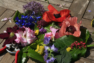
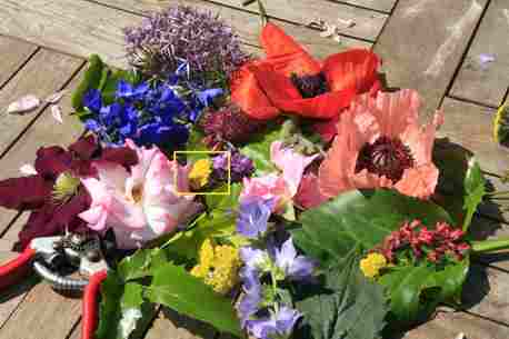
I went out into my garden and picked all the different coloured flowers I could see and stuffed them in an old tea pot. But I couldn't get them all to face the same way so I cut off all their storks and laid them flat on my garden table. This is the result:-
This is certainly not an artistically arranged still life, it's just the result of me, a mere physicist, laying the flowers out so the camera could see them all.
The camera is looking down on the table at about 45° with the sun shining across the table from the left at nearly 90° to the camera's line of view. It is taken at 1/125 sec f16 on a Canon 24-70mm f2.8 zoom lens set at 68mm with no filters. The 5D is set in landscape mode, auto white balance and Adobe RGB colour space. This is the JPG file produced by the camera with no post processing by me, except downsizing in Photoshop to 320 x 213. Left click, or Right click and SAVE AS, for the original 4368 x 2912 JPG file (5.7 Mb).
There is a lot of detail in this photograph, and plenty of subtle hues. I confess that, although taken at f16, it is not sharp at the front or back, but it is pretty sharp everywhere else. With this focal length and aperture, the depth of focus is not quite sufficient for the subject matter.
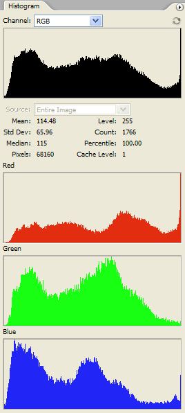
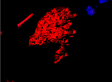
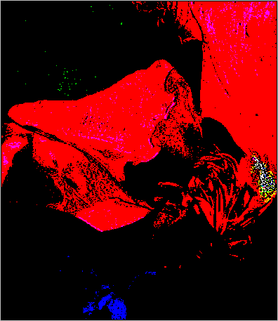
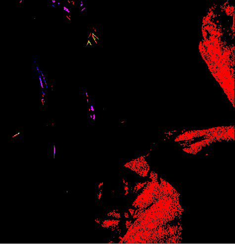
The photo was taken with the 5D in its default evaluative exposure mode and with no exposure compensation. Photoshop's histograms and LEVELs displays show that there are some blown pixels, especially in the red channel:-
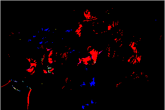
There are also a few blocked shadows, showing that the subject cannot be accommodated within the 256 levels of a JPG file with the tone curve applied by the camera. But I'm not bothered about those right now.
The question I'm interested in right now is "Do these moderately blown highlights seriously affect the image quality? Or would we see little difference if we compared this image with one exposed to avoid blown highlights?"
Luckily, I took another shot with -1 EV exposure compensation. You just knew I had, didn't you? Here it is:-
 Well, obviously, it's a lot darker. But it has almost no blown pixels, except on the specular reflection on the spring of my secateurs at the bottom left of the picture. (Of course, it also has more blocked shadows than the other one.)
To make a sensible comparison between the two images we need to adjust the second one so that it looks about the same brightness as the first. I did this in Photoshop, judging it by eye, using a CURVES adjustment like this:-
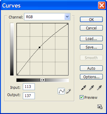
It is a feature of such an adjustment that it generally brightens the picture without creating any more blown highlights (so long as the curve doesn't touch the top edge of the graph except at 255).
Now that we've got the two photos looking about the same, we can compare them in detail using 100% crops. Compare the two pictures below and decide for yourself what the differences are before scrolling down to my comments:-
| With blown highlights | Without blown highlights (1 stop less exposure) |
 |
 |
 |
 |
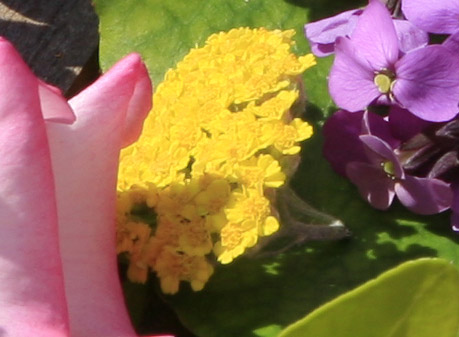
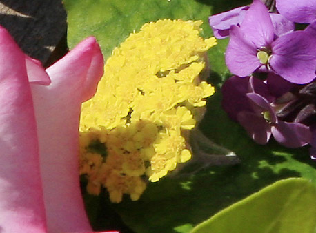
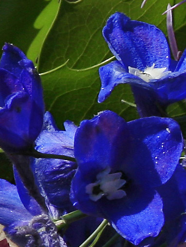
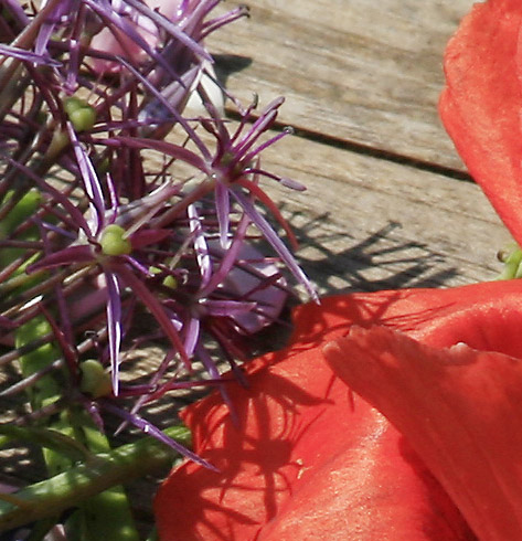
My first thought was that the over-exposed one (on the left) looked sharper. In fact, the focus was set manually and was not changed between these shots. If you look at Photoshop's blown pixel display (beneath lefthand photo), it is clear that the red channel is blown across the yellow flower. This makes bits of it appear a darker, egg yolk yellow, rather than the lemon yellow of the right hand photo. This change in colour creates artificial detail that wasn't present in the subject: hence the impression of sharper focus. In this clip, the darkening of the yellow due to the red channel being blown is the most noticeable difference. The mauve flower top right appears a slightly more uniform hue in the righthand picture but the shadowed area below it is darker. I suppose that I could brighten that by further action with Photoshop's CURVES if desired. Everything else seems about the same.
Here's another crop:-
| With blown highlights | Without blown highlights (1 stop less exposure) |
 |
 |
 |
 |
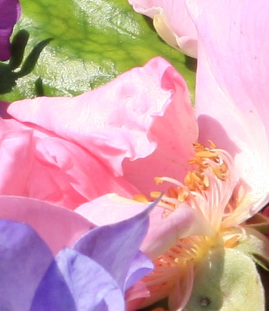
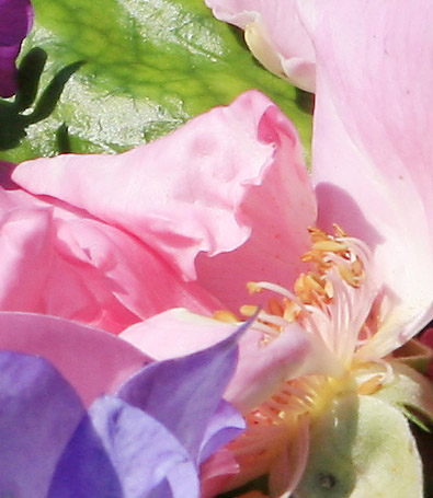
The main difference is in the pink petal centre left that is shaped like a bicycle saddle, where the effect of the blown red (and blue) channels is that there are blotches of white with no detail and a lack of continuous tone. This is also the case in the area to the right of the vertical stamens where all three channels are blown. The specular reflections off the green leaf top left are not affected as, surprisingly, they are not blown. On the 'saddle', and on the pink petal at top right, there is a slight shift of hue towards blue, particularly in the less brightly lit areas.
Here's another crop:-
| With blown highlights | Without blown highlights (1 stop less exposure) |
 |
 |
 |
 |
The righthand one looks slightly sharper but I don't know if this is due to an unintended change in focus between shots or due to the different exposure. The righthand one retains a little more detail, and appears slightly more saturated and of more uniform hue. But on the whole there's not much to choose between these two.
Here's one more crop:-
| With blown highlights | Without blown highlights (1 stop less exposure) |
 |
 |
 |
 |
Again, there's not much to choose between these two, but to my eyes the red poppy appears more vibrant in the blown (left) one.
All in all, I conclude that, for this kind of subject, one stop of over-exposure produces a slight, but hardly noticeable, reduction in quality of the image.
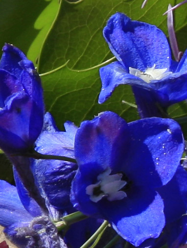
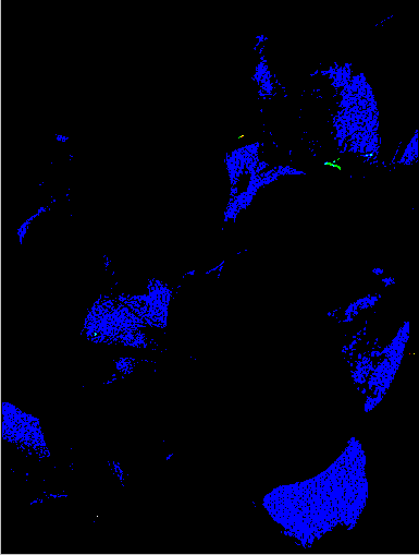
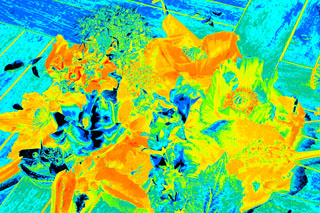
It should be noted that, although this picture has a wide variety of colours in it, there are hardly any highly saturated pixels according to the HSB model. The actual saturation value of each pixel is shown in the false colour image below, in which I have replaced each pixel of the original image by one whose colour is determined by the saturation according to the scale shown. (The highest saturation in the image is in fact 93% in the blue flowers near the top left of the picture.)
 |
 |
|
Peter Facey, Winchester, England
20060720