 The brown one (1/3 sec) is almost but not quite clear of any saturation, I think (the spike in the histogram, not present in the orange one,
suggests to me that a few of the wells may be in saturation).
The brown one (1/3 sec) is almost but not quite clear of any saturation, I think (the spike in the histogram, not present in the orange one,
suggests to me that a few of the wells may be in saturation).This test used the data obtained for the response to light test, see here.
That test photographed a white board at f/11 and ISO 200 using gradually increasing exposures until saturation was reached.
Statistics of a 200 x 200 pixel area in the centre of the image are shown in the table for the green component:
Looking at the Min, Max and Mean values, it is clear that three longest exposures, at the top of the table, are completely saturated. I was struck, however, by the behaviour of the next two, for shutter speeds of 0.5 and 0.4 seconds. Both of these have less exposure than the top three, yet their Min, Max and Mean values are all noticeably (but perhaps insignificantly) higher than those of the top three.
It is not until we get to a shutter speed of 1/3 sec that we see something that is clearly not saturated. Here the Max is below the highest possible value, and the standard deviation leaps, indicating that Shot noise is no longer being clipped by saturation.
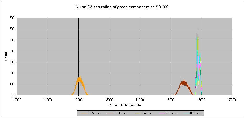
This graph shows the histogram of five of the exposures from the table:
The brown one (1/3 sec) is almost but not quite clear of any saturation, I think (the spike in the histogram, not present in the orange one,
suggests to me that a few of the wells may be in saturation).
If we expand the righthand end of the graph we see:
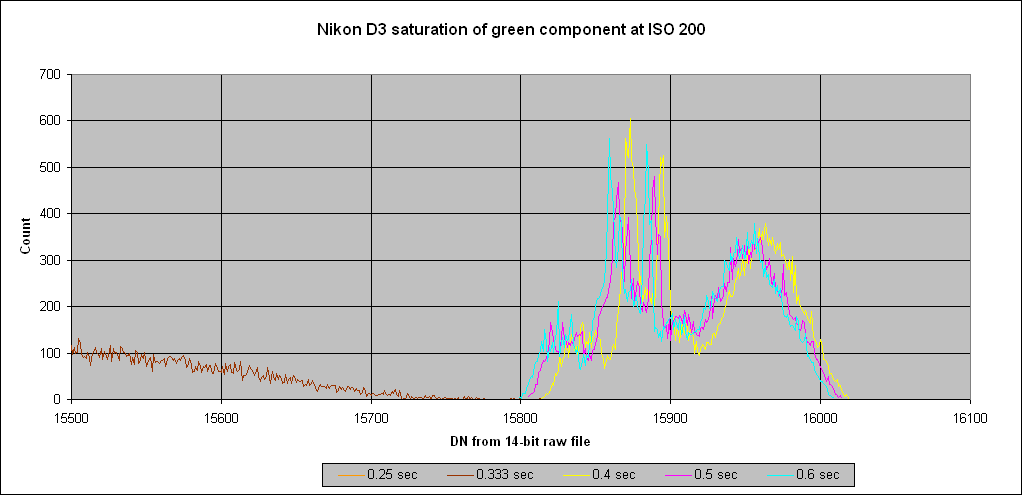
Note that here, in order of increasing exposure, it is brown, yellow, magenta, cyan (these are just colours I've used to distinguish the curves, nothing to do with colour in the camera). The yellow is only a third of a stop more than the brown, but it produces the highest DN values. Pushing further into saturation with longer exposures causes a slight backing off of the DN values. I am not sure what the cause of this effect is. It would not be significant photographically.
The narrower, but much more peaky, shape of the histogram at saturation is presumably caused by variations in the capacity of individual sensor wells due to manufacturing tolerances, coupled with the absence of Shot noise.

The picture shows the whole of the green component of the Bayer array for the 0.6 sec exposure. It is twice as high as one might expect because there are two green wells for every red or blue one in a Bayer array. The contrast of this picture has been greatly increased by stretching from 0 to 100% what originally lay between 15,799 to 16,009.
The image seems to reveal some structure within the sensor array, perhaps resulting from the way it is manufactured.
And here is a crop from the centre of the sensor image, shown at 400%.

I have not before examined what a sensor looks like when it is saturated, so I'm unable to say whether these images are typical or whether they tell us anything interesting about the construction of the Nikon sensor.
All the above applies to the green component of the Bayer array only.
Unlike the green component, which as we have seen never reaches the 16,383 limit imposed by the 14-bit raw file, clipping at 16,383 occurs for the red and blue components. The histogram of the red for various exposures is as follows:
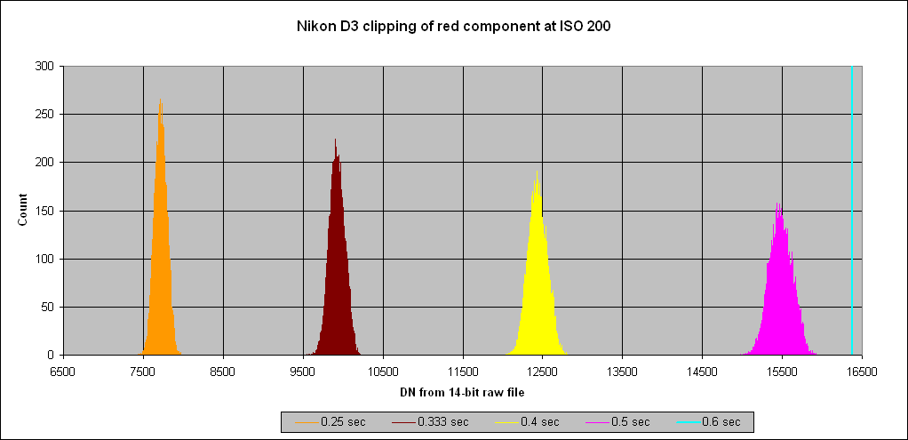
The widening of the histogram as exposure increases is attributable to Shot noise, until clipping occurs.
This differing behaviour of the red and blue compared to the green implies that the overall gain of the red and blue is higher than that of the green. On the assumption that the sensitivity of the Bayer filter/sensor combination is unlikely to be greater in the red and blue than it is in the green, this gain difference must be attributable either to differing analogue gain or to a firmware stretching of the red and blue DNs after analogue-to-digital conversion. In fact, the latter is the case.
Peter Facey, Winchester, England
20080217 minor correction
20080125 originated